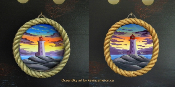
There’s a bit of ‘photo-shopping’ going on here as I have pasted one image over another before actually gluing the rope to the board on which the painting is on. The border/frame of the paintings are both gold. As you know, gold can take on different hues. Example: Venetian Gold looks different than Emperor’s Gold, etc.
It would be really appreciated to have your opinion on which gold you think looks best or more fitting.
There are different paintings in this series other than the lighthouse at sunset. So it may be best to not focus on which gold goes best with the lighthouse only. (Another sample here).
As always thanks for your input. I will be asking on facebook as well here.
It’s okay to just say I like “left” or “right”


for what it’s worth I prefer the “left” one…the “right” one is brighter but the left one blends more with the actual picture….
Thank you Barb!
The right one. It’s richer looking.
Thanks Lisa! I’m sorry , I somehow missed your comment. It’s very appreciated!
No contest: the one on the right is better.
The focal point of the composition is the top of the lighthouse. Because it’s red surrounded by a patch of orange sky, the warmer gold frame strengthens that focus. The whole piece is much more cohesive that way.
Thanks Man! very perceptive of you and yes the orange strip is intentional to sort of mimic the lighthouse rays. (these are little paintings I’m doing as local crafts)
i like the one on the right. the colors seem crisper to my untrained eyes. and the color of the rope seems more natural. nice composition.
Thanks! This is going to be a tough choice..maybe I’ll have to offer both options :^)
I agree with the others commenting, the one on the right appears to have richer hues in both the picture and the rope. Interesting how a subtle change in the picture can make such a clear difference in the tone of the whole. The way we perceive colour is a fascinating subject.
Thanks for your input. The light frame does seem to make the picture a little duller. It could have been the settings I used as well. Even the screens we’re all using might be making a difference.